

Showing posts with label design. Show all posts
Showing posts with label design. Show all posts
Wednesday, June 04, 2008
Dunkin' Donuts Now Dyeing Garments

Monday, May 05, 2008
Showing BARE, Saving Bucks
I'll keep it short and sweet this time. I promise.

Might I proudly present the BARE Magazine Blog, an extension of the eponymous student rag on whose staff I serve and whose second issue is right around the corner.

And so long as we're tickling your palette for fashion, I might as well let it drop that Yoko Devereaux's remaining stock from their Spring collection is now on sale, with items reduced as much as 80% off.
♦DiggIt! ♦Add to del.icio.us ♦Add to Technorati Faves
Sunday, February 24, 2008
Mind the Gap
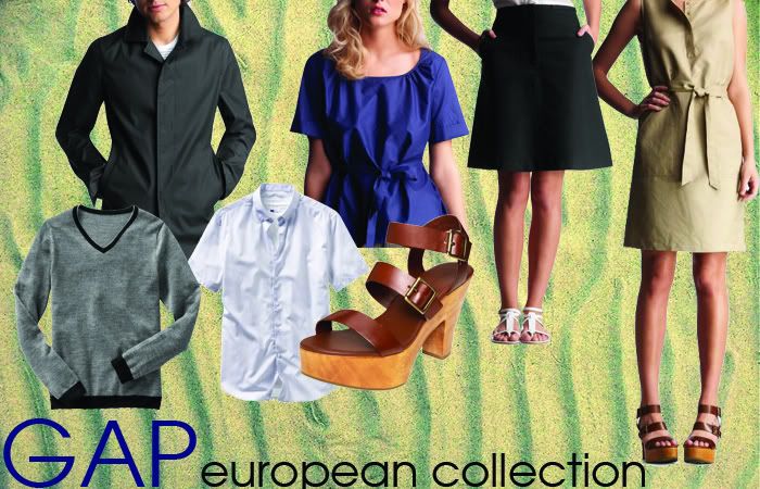
(Click for full-size image)
Is it just me or is Gap actually becoming much less repulsive? Their latest thing is a "European" collection for men and women that aren't really very European. Sure, the construction is a little more detail-oriented, but let's not kid ourselves, this is American sportswear. That being said, this is damn fine American sportswear. From the men's mac to the ladies' sleeveless belted dress, I am finding pretty much everything in this little collection to be chic, understated, and rather effortless.
The price point (from $30 or so for tops up to $168 for coats) is diverse enough that you could either buy everything and call it an investment or just select a few items and consider it a bargain. The fact that it's part of the European collection means that the fit is a bit slimmer, a little more body conscious. Which, given the clean lines and rather sophisticated silhouettes, seems like a very good idea.
Honestly, prior to this, I had been trying to avoid Gap for quite a while, as diluted as their vision has become thanks to poor creative direction and the endless flood of Product(RED) garbage pouring out its doors. But now that Patrick Robinson is in charge, the brand has received a nice injection of well-edited opinion that reflects upon a genuine attempt to re-cultivate the company and re-position it as a pre-eminent source of uniquely American clothing. Is it totally successful? Well, I'd really like to give it a yes, but I can't say yet. We've still got to see what the mainline stuff for Fall is going to look like. But given the previews so pleasantly provided by Style.com and Men.Style.com, I'm rather optimistic about Gap's outlook.
As always, the rising price point gives me pause, but with the not-quite-a-recession that we're going through, it's expected that costs are going to be adversely affected. That notwithstanding, it's mass market clothing that still boasts some solid design.
♦DiggIt! ♦Add to del.icio.us ♦Add to Technorati Faves
Sunday, February 17, 2008
MDBB: London Fashion Week F/W '08
Mind dump brainblog. noun. The result of my extreme bored with school (e.g. journalism mid-term and the massive readings that I'm supposed to do) coupled with my skill in wasting time. A chance for you to ride along in my head as I flip through Style.com's coverage on London without illustrations, which will be added when I am less pre-occupied with not failing.
MISSONI
(11:10 PM - 17/02/08)
- Why does it feel like Missoni is meant for some old, rich lady now?
- Where did all the knit go? Did all the sheep die in Italy? I don't understand this.
- Some of these shoes are damn fine and sophisticated. Classy stuff.
- Cute red dress with twisted bubble hem. I never thought I'd live to see the day.
- Very anti-body-con (how bad are these buzzwords going to last?) dress in color blocks. Typical sophisticated palette. But nice tweak.
- The jury's still out on the mushroom-puff-collar-bumble-hem sheath.
SINHA-STANIC
(11:33 PM - 17/02/08)
- I don't think I can really handle this shiny dress in no established context. Too much, too early for me.
- I feel like the schizo-color block thing is a little more effective in muted colors, not bright, saturated ones.
- I like the silhouette of the pouf skirts to the fitted tops with the slightly shell-like short jackets. It's an interesting look.
- The stacked/wrinkled tight knit dresses are really doing it for me.
- Some of these proportions seem a little funny.
- Interesting cobweb knits. The color choices are definitely striking and the overall effect really makes you think about what knits can do.
- I just don't buy these shoes. Sorry. Next.
- But Fiona is as cute as ever. Thank the heavens.
CHRISTOPHER KANE
(11:48 - 17/02/08)
- Okay...this is...different.
- The severity and the piallettes make for a super subversive combination. Very tongue in chic.
- There are definitely better and worse examples of transparency.
- None of these are even really standing out to me.
- If I bought those shoes, I'd rip off every single thing dangling off of it and throw it at people in ugly jeans.
JUST CAVALLI
(11:55 - 17/02/08)
- I just feel obliged to do this because Cavalli wasn't a half-bad judge on Project Runway, so I have to give him some props.
- This hat is a good start.
- Why haven't I seen more Biba stuff around?
- I do love these shoes.
- For the age group/price point to which it belongs, some of these shorter dresses are pretty cute.
- Some of the florals are pretty restrained, considering what Cavalli typically goes for.
- Puffy sleeve blouse under tweed (?) dress with subtle floral tights, metallic shoes, and drawstring bag that reminds me of a bag of magic? Sign me up, yes.
ERDEM
(12:08 - 18/02/08)
- Already liking this a lot. It's got drama, it's got style.
- The blur print is absolutely magnificently executed.
- This duchesse looks like it probably costs a million bucks, and it probably does, too.
- The jackets kind of came out of nowhere.
- But the second yellow one is really hitting the spot for me.
- Some of these coats are less successful than others, but still a very good effort.
- The darker hues definitely work better, but I'm totally falling in love with all the purple everywhere this season.
Good work team. We'll figure out how to class this up later.
Art of Darkness

I saw this ad for an online design competition being sponsored by American Express and run by Glam over at Connie's and decided to just snoop a little. Lord was I in for a shock. The majority of these are ugly as sin. Not just because some of these folks clearly aren't fashion illustrators—that's an understandable result of a competition open to anyone and everyone—my problem is that these folks are the semifinalists. I thought about just leaving it at that, but I seriously have to go through these one by one and rip them apart.
 Monique decided to take inspiration from a "candle from the Bahamas". Well, this explains why this is a big, hot mess. I think this girl just decided to throw on as many ideas that she associated with "pretty dress" onto one sketch. Plunging neck? Check. Asymmetrical back strap? Check. Low-cut back? Check. Contrast color star? Check. Oh please. Maybe instead of taking "time out of her classes", she needs to focus a bit more.
 "Elaborate"? "Eco-minded"? What is that little thing running down the middle? A bib? Well, you might be throwing up all over yourself if you're wearing this, so I can understand the need. And I bet a ton of people voted for her just because she claimed that this was "made from bamboo". Pssh. I'm from the Bay, girl. I know some real sustainable clothing lines and none of them look this bad/boring/bad. And can we talk about those ridiculous feet? I understand that it's hard to draw shoes, but anybody with a real eye can see that Alexandra still clearly endorses the idea of bound feet, which I don't think is very fashion forward.
 I appreciated Anne's attempt to distract me from her boring, boring dress with her model's legs. I know how far a good pair of stems will get you, so I understand what she's trying to do here. Unfortunately this does not change the fact that her dress is basically something that you can buy from any of the following establishments: Forever 21, Target, H&M, Charlotte Russe, Wet Seal, et cetera. A draped neckline and high hem do not a hot dress make.
 Not bad, Carrie, not bad at all. Your appeal to my Kate Moss-centric sensibilities definitely earns you a point or two. Your styling, however, leaves something to be desired. Short skirt? Flapper inspired look? Please, don't hurt yourself stretching. I know it must be difficult. The layered skirt, ruched bodice, and asymmetrical strap/collar create some visual interest. I won't be too hard on Carrie because, unlike so many others, she actually tried.
 Let's get a few things straight. This is about clothes. I don't know how much time you spent drawing your model's face, but more importantly—and you really ought to be taking notes here, Christina—I really don't care. Droopy cowlneck double-knit dress? Gross. And what the fuck is that on the dress anyway? Did you just make a screenprint out of a piece of your grandmother's couch? And you added leggings. It's like serving a shitcake with piss frosting and a big bowl of frozen vomit on the side.
 Now Jessica, I know this is going to be hard for you to understand, but I'd like you to follow along with me very, very carefully. I'll say this slowly to make sure that you get everything. There. Is. A. World. Outside. Palo. Alto. I understand that it's hard to envision a place where everyone doesn't have legs that go on for days, where people don't feel the need to tie their hair into a pony-tail and throw it over their shoulder every day, where the median income for a family is actually less than $117, 574 (I know, take a minute with that one, Jessica). But just because you don't know about this world outside doesn't mean it isn't there. So please, don't pillage some Asian culture with your "Kimoyes" dress in an attempt to make a dress that everyone's seen in a million iterations already.
 I never thought we'd get here without me becoming physically ill, but Mary's little number might do the trick. I have been increasing my caloric intake, so this just might be the solution. (I kid, please no angry e-mails. I already eat like a cow. Now get off my nuts.) I think you should try patenting your "triple keyhole neckline", Mary, because I really don't think anyone else has (or ever will) try out that little trick. Did I also mention how deliriously high Mary's model is? And how closely she resembles one of my elementary school teachers? No. Well, she is and she does. Also, the length of her arms may be an indication of knuckle-walking, because Lord knows that my arms don't reach down past my knees.
 Folks, if we work together, we can stop bad fashion from happening to good people. Or, in this case, bad people happening to good fashion. Because then all you're left with is ugly people in ugly dresses making everyone else feeling uncomfortable.
Also, sorry for the bad Conrad pun. Just couldn't help myself.
♦DiggIt! ♦Add to del.icio.us ♦Add to Technorati Faves
Monday, February 11, 2008
Wallet Alert: Not-Bad Bags


(Livity Urbanite Messenger Bag, $70 @ Tobi)
I hate sacrificing style for substance. It's an inherently painful exchange. Often times, the choice that would be better for the planet is usually the much less aesthetically pleasing one. Hell, it's usually straight up ugly. Thankfully, the folks at Balkan Tango, a Hungarian design group, have managed to circumvent the whole issue with their recycled bags. I've seen people make those LP bags before, but the Budapest, made from six punctured bicycle tires, certainly managed to catch my eye.
What I love most about the bag (aside from the ability to sidestep all that guilt) is that all the flaws and quirks of the tires, from the brand to the specifications, all merge into the bag's identity. It's a clever idea and I'm pretty sure that no two bags are alike. This is seriously looking like a very replacement for my current bag.
Likewise, the Livity Urbanite is a classic messenger, replete with side pockets, front zip pocket, and velcro closure. Made of hemp and cotton with rafia pockets, this bag is the definition of going green. My only fear is that it's a bit too granola for my style. Lord knows I'd be absolutely horrified if some grungy hippie came up to me and asked me where I got my bag. But at $70, it's a much more viable option than the Balkan Tango one.
A bag, a bag, my kingdom for a bag...
Sunday, February 10, 2008
And Now For Something Different
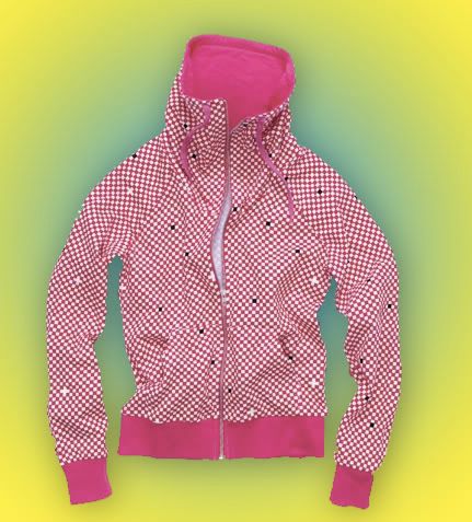
(Mock-hoodie designed by Tiga, $34.90 @ H&M)
I recently went out with the girls to check out H&M's "Fashion Against AIDS" campaign, but instead of contemplating epidemics, I found myself more concerned with celebrity and fashion. Or, more accurately, the intersection between the two. Now, this is a fine hoodie. It's cute, it's a little different, but really, if we're trying to be objective about the whole matter, this isn't a ground-breaking design (not that I expect that from H&M anyway). But Alison was absolutely dedicated to the idea of getting this and the Justice t-shirt (which I refuse to put up here because I think it's absolutely horrible).
While she was trying it on, I realized that this is very far removed from my own aesthetic and I couldn't find anything to really say about it. It's just a few steps too distant from what I normally shop for that I felt a bit ill-equipped to try and critique it. If forced, I'd say it's quaint. Cute. It's not a real hoodie, like the boys version, more of a mock-turtle/cowl-neck zip-up, which I suppose is a bit different. The all-over pattern, though not my style, falls right in line with the crowd that listens to Tiga.
But what I really was pondering was, what motivates folks to buy these items? They aren't particularly well-designed, far from well-made, and are available, en masse, to anyone who wants to buy them. Heck, the racks were pretty well-stocked at the Emeryville H&M. So if isn't cut, construction, or quality that is driving the purchase, what is it? Putting my ear to the ground (Googling and pondering and having another glass of cabernet sauvignon), I think it's sheer celebrity that makes people buy these things. Now, don't get me wrong. I love Rufus Wainwright and Justice and the rest of these folks (except Good Charlotte) as much as the next guy, but I found all these clothes completely insufficient according to my standards.
And now I'm starting to wonder whether or not that's a legitimate reason to buy an article of clothing: just because someone talked to a designer who talked to a press agent who talked to one of Margareta van den Bosch's myriad assistants and put this out, does it mean it's worth your time? The obvious discrepancy between Alison and my view of fashion is that for her, the fact that Tiga was involved in the making of this item is an inherent part of its worth. According to her evaluation, the item's linkage to the Canadian DJ is absolutely inextricable from its actual existence. My attempt to dissociate the man from the clothing, on the other hand, means that I don't take into account his involvement at all.
Neither of us are wrong, per say. Obviously I disagree with her viewpoint that a name can make a piece of clothing "good", but the thing here is that we're judging the same piece based upon entirely different criteria. So no, I would never buy it. No, I would never wear it. But I accept that and, more than that, I'm happy with it. Never before have I really realized how different two value systems can be and I'm supremely satisfied with the gap. It's comforting to be in my own aesthetic bubble. But it's even better when you can see the clear, definite outline of someone else's bubble. It gives you a better sense of what you wear, of who you are, and of who you want to be.
Friday, February 08, 2008
Dress You Up in My Love
Oak is back with a vengeance and a new location on Bond Street. But, more importantly, there's tons of new stuff in stock. What I've always loved about Oak has been the balance they've struck between the avant-garde and the everyday.

Not just a cardigan, not just a wrap, not just an another layer. Kerrigan creates an elegant solution to the question of "What should I wear today?" Everything about this piece just screams "Wear me!" from its jersey fabric to its drawstring collar, to its draped pockets. The heather gray is a nice contrast and is the perfect color to showcase the construction. At $262, it's certainly a pricey investment, but this is certainly a piece that would be able to weather the shifting winds of fashion.

One thing I've always loved about Opening Ceremony is that while the folks that run it certainly have an eye for design, they've always been willing and able to fill the holes in their wardrobe for themselves. The result? Pieces like this stainglass hoodie can easily work itself into your closet, but are unique enough to stand on their own.
Oh, and how much do I love the Oak product shots? They're half the reason I shop there anyway.
Thursday, February 07, 2008
Two Bright, Spiky Things
Meet my new time sink: Supermarket. Like Etsy, but not, Supermarket (claims to) present a curated collection of underground designers. It's the classic boy-meets-web, web-sells-things, I-wind-up-more-broke-than-usual love story. I'm thinking of picking up a certain something (Which I refuse to reveal until I get it. You know, for suspense), but here are two other gems—half-literally, half-figuratively—that caught my eye.

If I actually lived in my own real apartment and had a real job and had the real capacity to change my light fixtures, the Bendant Lamp would certainly be pretty high up there on my list of things to try and install before giving up and hiring some big, well-muscle handy-man to do it for me. Or Alison. Alison knows how to nail and hammer and whatever. The foils (for lack of a better name) can be bent to create the lamp configuration that you like best and given my protean tastes in decoration, that would certainly be a bonus. That would certainly remove the temptation to replace it every two months.

Now, I've had mixd feelings about brooches in the past. Usually they're a bit too hard to pull off. They're either too big or too shiny or too obtrusive or too round or something. The problem definitely resides in the almost-too-excessive nature inherent in a brooch. But the folks at Nervous System scaled the color down, focusing on an abstract form that I could see just as easily pinned on the collarbone of your favorite shift or on the lapel of a tailored blazer.
I worry. I honestly worry. Now my professors are going to have to fight for my attention. Oddsmakers are putting them are pretty slim chances. And to Lauren and anyone else who might see this, I apologize in advance for the hours of your life that I am stripping from you.
♦DiggIt! ♦Add to del.icio.us ♦Add to Technorati Faves
Wednesday, February 06, 2008
Watch the Runway: Proenza Schouler F/W 08


Thursday, January 24, 2008
Excuse Me For a Second

Now, I don't do this a lot, because I think I come through gay enough, as is. There's an obvious attempt to talk about some politics and art and music because I find that stuff interesting, too. But if fashion's available as a choice, 99% of the time I'm probably going to wind up talking about fashion. I don't know if that's a short-coming or a show of passion, but that's exactly what is it.
And I specifically try to avoid talking about Project Runway. Those in the know (apologies to Tavi and Alison) know how much I yak yak yak about it. It's endless, needling, and completely inappropriate. It comes out of my supreme and deep-seated love for the show.
But ladies, please pay attention. What we have here is the only denim dress I have ever endorsed. Please write this down on your calendars. It's absolutely fucking historic. Sweet P on the latest episode of Project Runway, "Even Designers Get the Blues", created the cutest, most elegant, and most strikingly modern denim dress I could have imagined. The color-blocking is just as striking as anything Vince or Missoni could make. I even have proof, bitches:


Granted, these are very Fall-oriented looks, but the color block works just as well in Sweet P's dress. The lines are softer and the colors brighter, a perfect complement to the feeling and warmth that spring naturally implies. Also, the monochromatic choice of blues brings a level of sophistication that you wouldn't expect of a denim dress, which is why I love it. Then imagine seeing it close up? Think of the texture play there! It's darling and I can't get over it.
Why do I say all this? Well, two reasons, really. I feel that I'm sometimes a bit less receptive to certain things (i.e. denim dresses) specifically because I don't have a wide enough perspective. But seeing this has really forced me to think outside my typical aesthetic box to embrace something that I had previously always disdained.
But I'm more in it for the chance to bitch about how she got shafted while Ricky's well-made, but slutted-up tube dress got the win. Because you know it's true.
(Images sourced by Bravo and Neiman Marcus)
♦DiggIt! ♦Add to del.icio.us ♦Add to Technorati Faves
Monday, January 21, 2008
Don't Get Too Attached
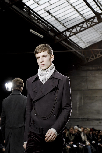
These two Attachment coats from their Fall/Winter 2008/09 line is the exact reason why I shouldn't be allowed access to the Internet. Both of these coats are beautiful constructed, the color is unbelievable, and I'm sure that they'll look even better in person. The Archive is the only place nearby that stocks Attachment, so I'll see if I can't find some time to stop in and try things on (and consequently break either my heart or my wallet). If I find employment performing menial labor for some currency, this is definitely one of those things I'd be saving up for.

Wednesday, January 16, 2008
Art is Good for the Sole


Aki Choklat's shoes are vaguely Victorian, a phrase which absolutely tickles the senses. Choklat's academic background (he's a visiting lecturer on design at various design schools in England) shows in the thoughtful construction and elegance of his shoes. A firm believer of "formal elements with directional styling"1, Choklat's shoes embrace the mysterious details so essential to menswear.
While he does make things other than black, it seems that he's most comfortable working in the inkiest shades. The ribbon loafer is, by far, my favorite piece, combining drama and sophistication like no one else I've seen. The boot's multiple layers unfold like some leather flower, creating the most delightful tension between the delicate and the rugged. And the asymmetrical tassel loafer turns convention on its head to wonderful effect. Available only by directly contacting him, I do wish that some boutiques would start carrying his pieces (I refuse to call such delicately crafted works of art mere shoes) so that I could fervently collect them all and leave myself penniless, but, more importantly, I'd fabulously dressed.
♦DiggIt! ♦Add to del.icio.us ♦Add to Technorati Faves
Tuesday, January 08, 2008
Out of the Mold Modern

(JF & Son, Spring/Summer 2008)
Thank god for Refinery 29 and for the many people in their employ who spend their time finding kick-ass stuff like this. Nowadays everyone is afraid of the term "Modernist", just because it's so passé to be one; people would much rather reflect on Modernism and critique it and talk about how we've progressed (or not). But if it was good enough for Virginia Woolf then it certainly is good enough for me.
Comprised of Jesse Finkelstein and Robert Cordero, JF & Son is, by and far, some of the freshest work I've seen lately. I'm honestly surprised that I haven't heard more about them, but I suppose having only produced two collections limits the amount of press they get. Usually, when people invoke Modernism, it winds up being drab and self-deprecating and, more often than not, a bit conceited, as though there's this big joke about reality that we're all supposed to be in on. But rather than giving in to the cynicism, JF & Sons honestly tries to be Modernist, in the most intellectual sense of the word possible.
The lines are clean, but never austere. The shapes, while body-conscious (which as the current wave of London designers have noted, is a bit played out of a phrase), actually make me want to say that they're style-conscious. And I'm not talking about style in the season-to-season sense, but in the greater scheme of personal taste and expression. Colors are not only restrained, but refined. Their Spring/Summer collection relies on off-whites and blacks with occasional pops of red and yellow for emphasis.
As of yet, they don't list any stockists, but I'm sure that it'll be coming along soon enough. Shit this good always finds a way out and about.
♦DiggIt! ♦Add to del.icio.us ♦Add to Technorati Faves
Resist Wrist

(Michael Young PXR-5 EL wristwatch, $90 pre-sale at Charles & Marie)
Honestly, the Internet does not help make me less broke (except for menial writing assignments and endless searches for magazine internships that have yet to appear) and the folks at Charles & Marie are obviously in cahoots with other awesome websites that are hungrily lapping up every stray dollar I have. One of my big obsessions is watches of all shapes and sizes, but I find I have difficulty actually wearing them, due to complications arising from a thin (and slightly limp) wrist and a distaste for anything remotely shiny that looks like it belongs on a banker's wrist, not mine.
This delicious number from Michael Young—a hard-to-Google designer whose own website does little to explain who is or what he does—comes in both brushed and polished steel (I have a soft spot for the brushed one, shown above), as well as more exotic (and expensive) black and gold versions with an adjustable wrist strap that comes in a variety of colors. Hell, you can even buy a pack of them for variety! What I love about Young's design is that it's design-conscious but blissfully unpretentious. The combination of stainless steel with a synthetic fabric strap creates a delicious tension between something utterly polished and something utterly utilitarian.
While I could blather on and on about this baby, I'd really rather save my time scrounging for spare cash so I could get one for myself.
♦DiggIt! ♦Add to del.icio.us ♦Add to Technorati Faves
Friday, January 04, 2008
Rainy Days Provoke Thoughtfulness

Here's another one that I can't take credit for (all of which belongs solely to The Red Dot), but the Emily Carr Institute Art + Design, having graduated talents like Neko Case and Terence Koh, has just opened up the studioshop. It's basically a classy Etsy—not to say that Etsy isn't classy—but having some pretty heavy artistic credentials does lend it a certain status. The store if filled with tons of goodies, including this awesome piece from Sarah Fuller's series' called The Photographic Tarot Project. I'm already a sucker for symbolism (the time spent decoding the album covers for both Ys and Sergeant Pepper's Lonely Hearts Club Band attest to this) and Fuller's work displays this amazing tension between adult sensibilities and child-like whimsy.


(She is a Lovely Vessel by Diane Espiritu)
Diane Espiritu's pottery definitely has a down-to-earth feel, but the ethereal and often incomprehensible patterns (ribbons? flowers? faeries?) takes the traditional vase and turns it into a wonderful aesthetic question. I don't know if I should put flowers in it or just leave it on a shelf, but I know I want it. And the color is to die for.
Why, oh why, couldn't I have been born with some measure of talent?
Monday, December 31, 2007
I Got Greed For...

Rather than sleeping, I (in a fit of delirious consumer lucidity) stayed up and shopped for no good reason other than the fact that I love toying with my own desires.
I've always been of the opinion that any man worth his salt needs an empty book and a full pen with at him at all times, as it indicates both readiness and receptiveness for all matters earthly, spiritual, and literary. Fisher designed the original Space Pen, a writing instrument invented solely for NASA. Faced with the challenges of weakened gravity, blistering heat, and intense cold, Paul C. Fisher created a pen that writes using 35 pounds per square inch of pressure capable of writing at temperature extremes from -30 to 250 degrees Fahrenheit, underwater, and at any angle imaginable.
Their bullet pen, in the above shown matte black, is a miniaturized version of their original space pen and has been screaming my name for two years. One of these days, I'm just going to plunk down the Jackson and make it my own. Armed with this and my Moleskine, I might very well be unstoppable.
Tuesday, December 25, 2007
Comics, How I Love Thee
 (From left to right: The Laird of Wales, Fallon Young, Ryan Beckwith, Shelby Winners, Tim Jones)
John Allison's Scary Go Round is an everyday read for me, first and foremost for its uncanny wit and remarkably charming cast of characters. But there's plenty of design candy, too, as Allison populates the fictional Tackleford with a cast of characters with sense of style as sharp as their wit. Thanks to the ever-expanding cast's series of misadventures, we always have to occasion to visit them in various locales and situations which necessitates an equally broad wardrobe. And honestly, who doesn't want to live in Tackleford?
Oh, and Merry Christmas, everyone.
♦DiggIt! ♦Add to del.icio.us ♦Add to Technorati Faves
Friday, December 14, 2007
Design for Information
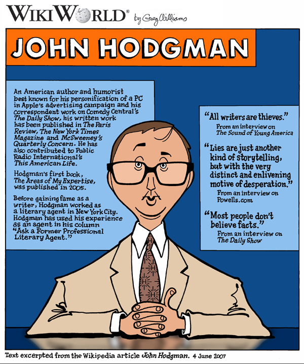
I have got to say that there are some deliriously inventive ways people expand the Wikipedia project and the inclusion of graphic art is a definitely a big plus.
The WikiProject WikiWorld is a collaborative effort of several editors along with artist Greg Williams to utilize his different illustrations and infographic designs to briefly summarize Wikipedia articles. The variety of Williams technique, including the depth of his humor and the fluidity of his style, creates an interesting way to look at how art, technology, and information combine in the modern world.
More than anything else, this is an affirmation that we aren't descending into the deepest trenches of cultural decline. Instead, it seems like our general culture is learning to absorb more information and to do it in both aesthetically pleasing and aesthetically interesting ways. In centuries past, design was meant for luxury, for symbolism, for artistic greatest. Only nowadays would we ever have need design for information.
♦DiggIt! ♦Add to del.icio.us ♦Add to Technorati Faves
Subscribe to:
Posts (Atom)


